Tuesday, November 19, 2013

Parallel coordinate plot


A parallel chart is a visual chart that shows the differences in a collected amount of data. 
When using the parallel coordinate plot for statistical data; considerations must be taken. The order, rotation, and scaling of the axis is important. 

Star Plots


Star plots is a graphical map that displays many variables of data in a two dimensional chart of three or more variables shown on a axis. All data variables starts from the same point. 
Star plots are also known as radar charts, polar charts, web chart, and spider chart. 

Correlation Matrix


A Correlation Matrix shows the correlation between all the pairs of data sets. 

Similarity Matrix


A similarity matrix is a matrix of data that expresses similar data between a number of data points. It is used to find clusters of data points and can be used to align sequences of DNA. The higher the score, the more similar the data. The lower the score the dissimilar the data. 

Stem and Leaf Plot


A stem and leaf plot is used for depicting frequency among common numbers. The numbers are grouped with like numbers to show the frequency. 
It uses quantitative data in a graphical form, similar to a histogram. 

Box Plot

"This box plot reveals that machine has a significant effect on energy with respect to location and possibly variation"


A box plot is a graphical depiction of a set of numerical data. it is a convenient way of viewing the data through quartiles. You are able to see the differences between populations without making assumptions of the statistical data.  

Histogram


Histograms are graphical representations of distributed data. It estimates the probability of the distribution of a continuous variable. The representation shows the variance of the frequencies; in intervals. The total area of the histogram must equal to the number of the data.  

Triangular Plot


It is also known as a ternary plot. It is a plot of 3 variables. A triangular plot is graphically showing the rations of the 3 variables as positions in a equilateral triangle. All three variables must add up to the constant.  

Windrose


Windrose's are circular  plots that shows how the frequency of wind move in certain directions. It uses a compass points to show wind direction. They are used by meteorologists to determine the speed and direction of the wind distributed in a specific location.   

Climography


A climograph is a visual of he monthly precipitation and temperature conditions in a particular place. 
The bars represent the precipitation over time and the line represents the temperature. This map allows a person to get a sense of the climate in that region throughout the course of the year. Which means there are many weather variables. 

Population Profile


Population Profiles show the population distribution of a region among different age groups. The data is separated as male and female. There are also known as population pyramids.   

Scatter Plot


Scatter plots are a type of mathematical diagram that uses cartesian coordinates to display values from to variables fro a set of data. There is a trend line often noted with computing the general relationship between the variables. 


Index Value Plot


Index value plots show the ratio of all the variables that are being compared against another in a specific period of time. It gives an average mean. It depicts relative data rather then the absolute data. The index value chosen and the data is plotted relative to that. 

Bilateral Graph


Bilateral graphs are an example of a visualizing map. The two related variables that are identify overlap. 

Nominal Area Choropleth Map


Nominal area choropleth maps use minimal data and displays it on a map using specific colors or patterns to represent the difference in percentages. 

Unstandardized Choropleth Map


Unstandardized Choropleth Map displays raw numbers. It describes the change in population as a whole. The more localized data is not presented. 

Standardized Choropleth Map


Standardized Choropleth Map demonstrates a certain area as a function of the interaction index. 

Univariate Choropleth Map


Univariate Choropleth Map is made up of isolated block variables for isolated geographical areas.  

Bivavariate Map


Bivavariate maps show two set of data on one map by combining colors.


unclassified choropleth maps


This map does not plot classes of data. It simply marks a change in the shade of color to represent data. 

Classed Choropleth Maps


This is a color coded map in which data is displayed by the colors in ranges or classes. Increasing or decreasing the number of classes can dramatically alter the appearance of the data. 

Continuously Variable Proportionate Circle Map


Continuously Variable Proportionate Circle Map is a proportional circle map that demonstrates the circles value by size. the size is relative to the data collected. 

DOQQ


DOQQ is a digital orthographic quarter quads. It is an aerial photo in which image displacement has been removed. Terrain relief and camera tilts create the distortion.  

DEM


Digital Elevation Model is known as DEM. It is a map that shows elevations of land or the sea floor. The computer generates  the elevation in a raster type map. The are usually topographic maps. 

DRG


DRG stands for digital raster graphic. They are scanned images of topographic maps. 

DLG

1:24,000 Scale Digital Line Graphs (DLG) SDTS Format Only


DLG stands for digital line graph. The digital representation is in the form of a digital vector and is set in layers which contain different types of data. It supplies digital information from topographical quadrangle maps. 

isopleths


Isopleth generalize and simply data that has a continuous distribution. Isopleths never cross or divide one another from there enclosures. It separates different meteorological data. An example would be elevation, pressure, or precipitation. 

isopach


Isopachs contain contour lines. They use strategic data to show the thickness of the chosen variable. Such as geological deposits, like the example shown above. 

isohyets


The contour lines on this map depicts the equal amounts of rainfall in a certain area during a given time period or for a particular weather pattern. For example a hurricane or thunderstorm.


Isotachs


Isotachs are contour lines that overlie on a map in order to separate a region with different wind speeds. It also indicates wind direction, making it a hybrid of a flow map. The lines in the given surface connect points with equal wind speed. It shows the areas with equal wind speeds.

Isobars


Isobar is a type of isoline that deals with barometric pressure. It is used ion weather maps often. The connect points of equal barometric pressure reduced to sea level. Isobars are contour lines a that overlie a map in order to separate regions with different air pressures. They end up circling the areas with the highest and lowest pressures.

LIDAR


LIDAR is an anagram for light detection and ranging. It determines how long it takes to return to the source to measure distance. LIDAR is a type of remote se as in technology. It uses laser pulse and scattered light to measure distance and ranges of a distant object. LIDAR is usually used to create topographic maps.

Doppler Radar


Doppler radar images are shown over a map of the local area to show the presence and movement of weather patterns. The map uses velocity of microwave frequencies. It uses the frequencies to calculate the highly accurate measurements of the targets velocity.
Doppler radar images are commonly seen on weather television  broadcast. 

Monday, November 18, 2013

Black and White Aerial Photography


Black and white aerial photography is a basic photo from above that is lacking color. It uses the grayscale. 

Infrared Aerial Photographs


Infrared photos are taken from above in the near-infrared spectrum of light. It is used to show the physical characteristics of geographical locations. It is often used to monitor the health of forest and wetlands, like the one shown above. 

Statistical Map


Statistical maps are a form of thematic maps. It shows some statistical variable over a geographical area. The variation is depicted with shading and colors. 
The above map depicts the statistical data of the percent of workers who commute by private car or alone. 

Cartogram

Cartogram of the projected 2008 Electoral Vote for US President (based on popular vote) with each square representing one electoral vote. 

Cartogram is a map where some thematic variable is substituted. The variable is substituted for land area or distance. The space of the map is distorted in order for the information to be understood. The two types of cartogram is area and distance cartograms. 


Flow Map


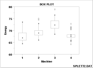
Flow maps are used to show the movement of data.  The flow is displayed usually as a graphical element overlaying the base map. This map indicates what is the flow, the direction and source, how much does the flow represent and the general information about what the flow is about and how it is flowing. 
This map shows the trade movement of cotton and wool imported throughout the world in 1858 and 1861. The blue represents Europe, Orange the British Territories in South Asia, Brown for Levant, Pink for Britain, and Light Blue for Brazil. 
The ratio for this map is 1 millimeter equals to 5000 tons of wool and cotton. 

Isoline Maps


Isoline maps are a type of map that uses contour lines that separate geographic data based upon a specific variable. The map shows continues lines that join points of the same value.  Map that show contours or elevations use isolines. Isolines are important in weather maps like the one above. 

Proportional Circle Map

Proportional Circle maps are a type of thematic map. It presents data in the form of circles. The circles are proportionate to the size of the data ranges.

Choropleth Map


Choropleth Maps are thematic maps that use shading or patterns in proportion to the represented data. The darker colors are perceived as being of higher magnitude. The drawbacks with choropleth maps is that smaller areas may not have much relation to the data so the contrast wont be be great. So , larger areas are needed to be used in order to show the visual impact needed, making the information somewhat misleading.

Dot Distribution Maps


Dot Distribution maps are also known as dot density maps. The dots are used to indicate the geographical occurrences. Even the presence of a phenomenon or characteristics. Dot map rely on the visual scatter to show spatial pattern.  
This dot distribution map shown above presents the visualization of geographic distribution, population density, and racial diversity of the American people in every neighborhood. Each dot is color coded by the individuals ethnicity and race. 

Propaganda Maps

Karte Von Europa Im Jahre 1914 by Walter Trier

Propaganda Maps are used to tell the perspective of the map maker. The cartographic information can be presented in different ways depending on who is making the map or table. The information is under the total control of the map maker.  

Hypsometric Maps

Hypsometric maps display information about elevations by using contour lines, shading, and color tinting. The tints are directly related to the contour lines .They are used to depict ranges of elevation with color. The tints can be used to make geographical information easier to access and it is a simpler form to display.   


PLSS Maps

   PLSS maps are Public Land Survey System Maps. It is a surveying method. It is used to survey and spatially identify land parcels before ownership is designated.

                                         http://nationalatlas.gov/articles/boundaries/a_plss.html

 
The North and South line runs through the initial point. It is known as the true meridian and it is called the Principal Meridian. There are 37 Principal Meridians. Each Principal Meridian is names and is used to distinguish the various surveys.
The East and West line runs through the initial point. That initial point is called the Bare Line. This line runs perpendicular to the Prime Meridian.


Cadastral Maps

Cadastral maps display the spatial selections of land parcel blocks. It can be used as a comprehensive collection of the real estate of a country. The map usually includes details of the ownership. The information can be used in the legal system as a source of data in disputes and lawsuits between land owners. Cadastral maps also help with maintaining records of public land.


This map has land numbered, and has the areas sectioned off with lines. You can clearly determine what areas is owned land and what are displayed as roads.

Thematic Map

Thematic maps shows a connection between certain geographic areas. It provides certain information about particular areas, general information about spatial patterns, and used to compare the patterns. Spatial accuracy, aesthetics, human flaw, perception, and the presentation used all me needs to be taken in to account.

                          http://soils.usda.gov/use/thematic/images/drought_1_gen_area_map.jpg


This particular map shows the soil moisture regime of the continuous United States. The color chart represents the classification of soil. The ratio used is 1:9,000,000. And the lines are used to show the division of land and when zoomed closer, the counties.

Topographic Map

Topographic Maps show the relief of an area using contour lines. Contour lines connect and show the elevation of certain areas. It is useful for those who need to understand the changing land, such as mountain climber or divers.


This topographic map uses colors to determine elevation. The blue are higher elevated areas compared to the brown.  The scale on this map is 1:250,000. Which is roughly calculated as 1 inch representing about 4 miles.